A concept landing page for a faith-based app designed to help people stay connected to their church, sermons, and community wherever they are.
Concept Project
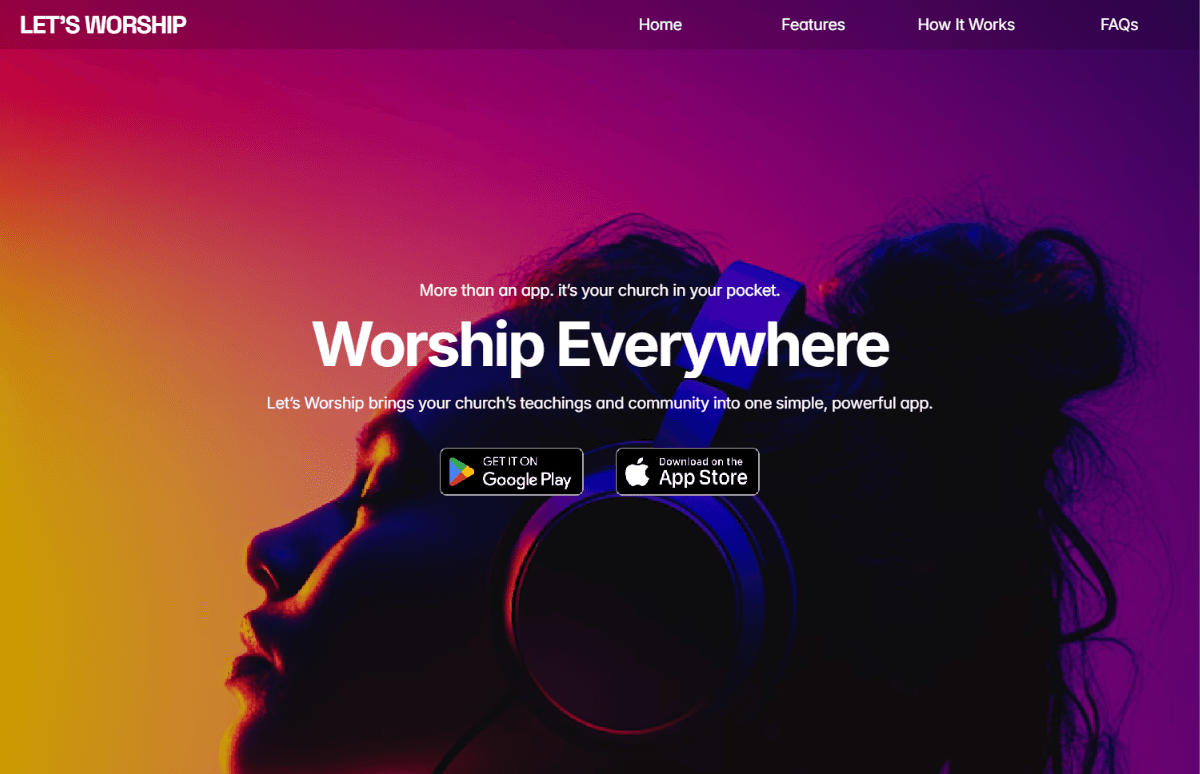
The Concept
Let's Worship is a concept for a mobile app that brings sermons, church updates, and community closer to people beyond the walls of their local church.
I designed the landing page to introduce the product, communicate its value clearly, and guide visitors from understanding the concept to exploring its key features and ultimately taking action.
The Opportunity
The challenge was to communicate the value of a faith-based app in a way that felt modern, welcoming, and easy to understand.
The landing page needed to quickly answer three questions:
What is Let's Worship?
How can it help me stay connected?
Why should I download it?
The Approach
Lead With the Value
The landing page opens with a simple proposition: your church in your pocket. This immediately communicates the core idea of bringing church content and community into a more accessible digital experience.
Showcase the Experience

Rather than explaining the entire product with lengthy descriptions, I used the landing page to highlight three core experiences—on-demand sermons, community conversations, and church updates.
Guide Visitors to Action

The page follows a simple journey from introduction to features, how it works, FAQs, and finally a clear invitation to download the app. The goal was to keep the experience focused on helping visitors understand the product and take the next step.
Key Design Decisions
Product-First Presentation
The interface and content are structured to make the app itself the hero, using product visuals to help visitors imagine how Let's Worship fits into their everyday lives.
Clear Feature Storytelling
The core features are presented individually, giving each one enough space to communicate its value without overwhelming the visitor.
Simple User Journey
Warm & Approachable Experience
The visual direction was designed to feel welcoming and human, reflecting the community-driven nature of the product rather than presenting it as a purely technical application.
Built in Framer
Designed and developed entirely in Framer, with a focus on responsive layouts, visual storytelling, and smooth interactions across screen sizes.
Design
Responsive Development
Interactions
Landing Page Structure
Designed for every screen.

Desktop

Mobile
What I Learned
This project taught me how to approach landing page design from the perspective of a product rather than simply a website.
The goal wasn't just to make the page look good. Every section needed to help visitors understand what the product is, why it matters, and what they should do next.
It reinforced the importance of clear product positioning, visual storytelling, and a focused user journey when introducing a new digital product.